Monitoring system bottlenecks with MC
The System Bottlenecks chart helps you quickly locate performance bottlenecks on a particular node. The first time you access the Activity page, MC displays the first node in the cluster. To choose a different node, select one from the Nodes drop-down list at the bottom of the chart.
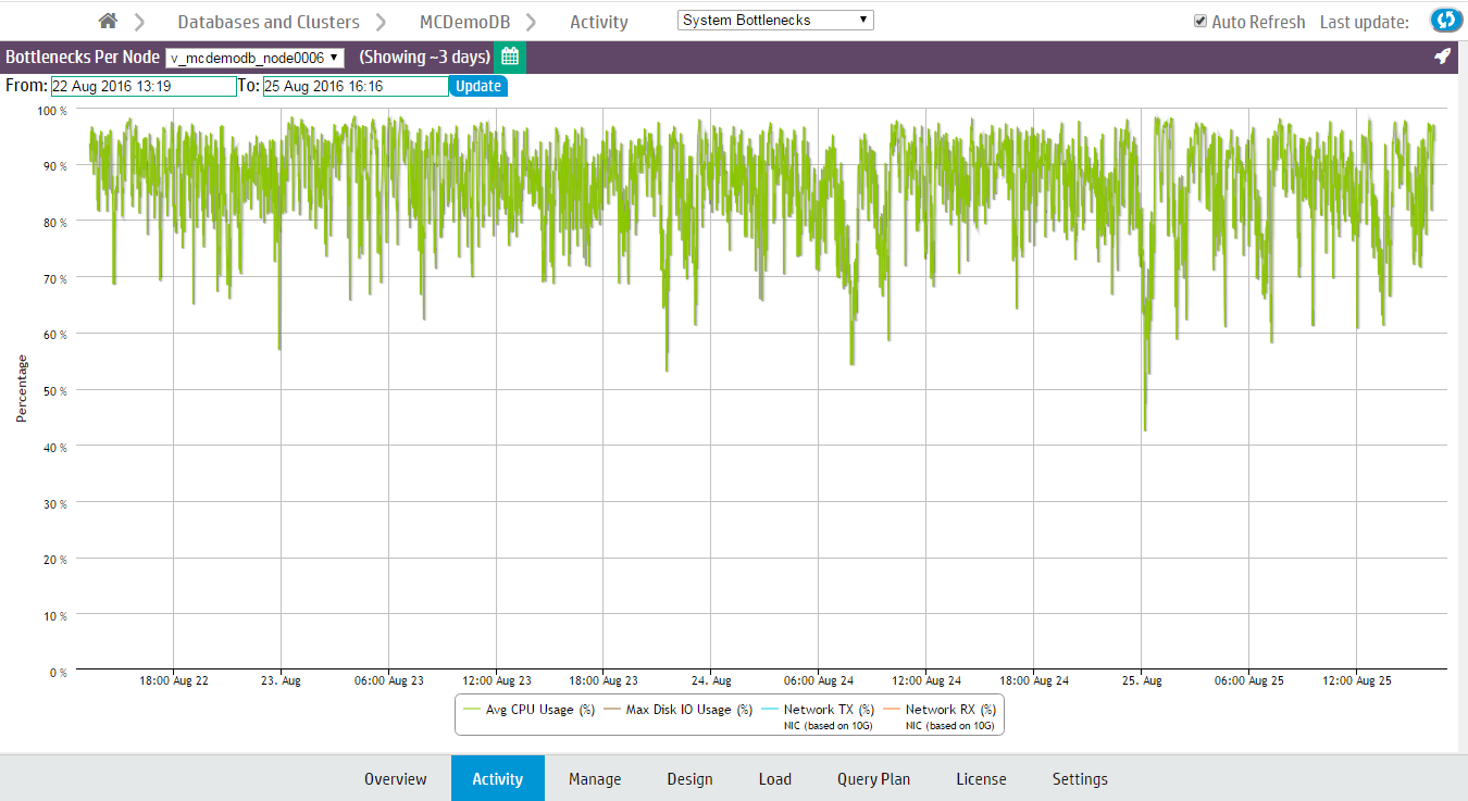
The System Bottlenecks chart reports what MC identifies as the most problematic resource during a given time interval. You can use this chart as a starting point for investigation.
How MC gathers system bottleneck data
Every 15 minutes, MC takes the maximum percent values from various system resources and plots a single line with a data point for the component that used the highest resources at that point in time. When a different component uses the highest resources, MC displays a new data point and changes the line color to make the change in resources obvious. Very busy databases can cause frequent changes in the top resources consumed, so you might notice heavy chart activity.
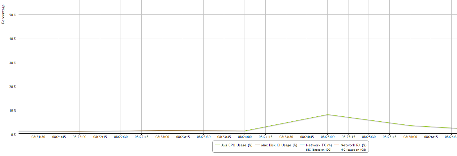
In the following example, at 08:24 the maximum resources used changed from Disk I/O to CPU. The System Bottlenecks charts denotes this with a change in line color from brown to green.
The components MC reports on
MC reports maximum percent values for the following system components:
-
Average percent CPU usage
-
Average percent memory usage
-
Maximum percent disk I/O usage
-
Percent data sent over the network (TX)
-
Percent data received over the network (RX)
How MC handles conflicts in resources
If MC encounters two metrics with the same maximum percent value, it displays one at random. If two metrics are very close in value, MC displays the higher of the two.