This is the multi-page printable view of this section.
Click here to print.
Return to the regular view of this page.
Monitoring system resources with MC
can be turned off by setting advanced.charts=false in the console.properties file, but don't document this.
MC's Activity page provides immediate visual insight into potential problem areas in your database's health by giving you graph-based views of query and user activity, hardware and memory impact, table and projection usage, system bottlenecks, and resource pool usage.
Select one of the following charts in the toolbar menu:
System-level activity charts automatically update every five minutes, unless you clear Auto Refresh in the toolbar. Depending on your system, it could take several moments for the charts to display when you first access the page or change the kind of resource you want to view.
Chart viewing options
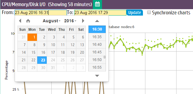
You can specify time frames for some charts, which display a calendar icon in their title bars. Click the calendar icon to specify the time frame for that module.
If you have enabled extended monitoring on your database, MC can display longer ranges of data in certain charts. See Extended monitoring. If a chart is using extended monitoring data, the rocket ship icon appears in the title bar:

You can expand some charts to view them in larger windows. Click the expand icon in the title bar to do so:

1 - Monitoring query activity with MC
The Queries chart displays information about query concurrency and average resource usage for CPU/memory, network activity, and disk I/O percent based on maximum rated bandwidth.
The Queries chart displays information about query concurrency and average resource usage for CPU/memory, network activity, and disk I/O percent based on maximum rated bandwidth.
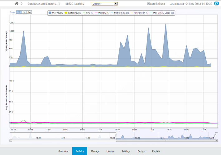
Hover over a data point for more information about percent usage for each of the resource types.
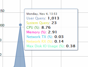
If you click a data point, MC opens a details page for that point in time, summarizing the number of user queries and system queries. This page can help you identify long-running queries, along with the query type. You can sort table columns and export the report to a file.
Monitoring key events
On the main Queries page, MC reports when a key event occurred, such as a Workload Analyzer or rebalance operation, by posting a Workload Analyzer (Workload Analyzer) and/or RBL (rebalance) label on the resource section of the chart.
Filtering chart results
The default query concurrency is over the last hour. The chart automatically refreshes every five minutes, unless you clear the Auto Refresh option in the toolbar. You can filter results for 1 hour, 1 day, or up to 1 week, along with corresponding average resource usage. You can also click different resources in the legend to show or hide those resources.
To return to the main Queries page, use the slider bar or click the 1h button.
Viewing more detail
To zoom in for detail, click-drag the mouse around a section or use the sliding selector bar at the bottom of the chart. After the detailed area displays, hover your cursor over a data point to view the resources anchored to that point in time.
For more detail about user or system queries, click a data point on one of the peaks. A Detail page opens to provide information about the queries in tabular format, including the query type, session ID, node name, query type, date, time, and the actual query that ran.
The bottom of the page indicates the number of queries it is showing on the current page, with Previous and Next buttons to navigate through the pages. You can sort the columns and export contents of the table to a file.
To return to the main Queries page, click <database name> Activity in the navigation bar.
2 - Monitoring internal sessions with MC
The Internal Sessions chart provides information about Vertica system activities, such as Tuple Mover and rebalance cluster operations, along with their corresponding resources, such as CPU/memory, networking, and disk I/O percent used.
The Internal Sessions chart provides information about Vertica system activities, such as Tuple Mover and rebalance cluster operations, along with their corresponding resources, such as CPU/memory, networking, and disk I/O percent used.
Hover your cursor over a bar for more information. A dialog box appears and provides details.
Filtering chart results
You can filter what the chart displays by selecting options for the following components. As you filter, the Records Requested number changes:
-
Category: Filter which internal session types (mergeout, rebalance cluster) appear in the graph. The number in parentheses indicates how many sessions are running on that operation.
-
Session duration: Lists time, in milliseconds, for all sessions that appear on the graph. The minimum/maximum values on which you can filter (0 ms to n ms) represent the minimum/maximum elapsed times within all sessions currently displayed on the graph. After you choose a value, the chart refreshes to show only the internal sessions that were greater than or equal to the value you select.
-
Records requested: Represents the total combined sessions for the Category and Session Duration filters.
3 - Monitoring user sessions with MC
The User Sessions charts provide information about Vertica user activities for all user connections open to MC.
The User Sessions charts provide information about Vertica user activities for all user connections open to MC.
Choose User Sessions from the menu at the top of your database's Activity page to view these charts.
View open sessions
The Open Sessions tab displays a table of currently open sessions for each user. You can close a session or cancel a query on this tab by selecting that option from the Actions column.
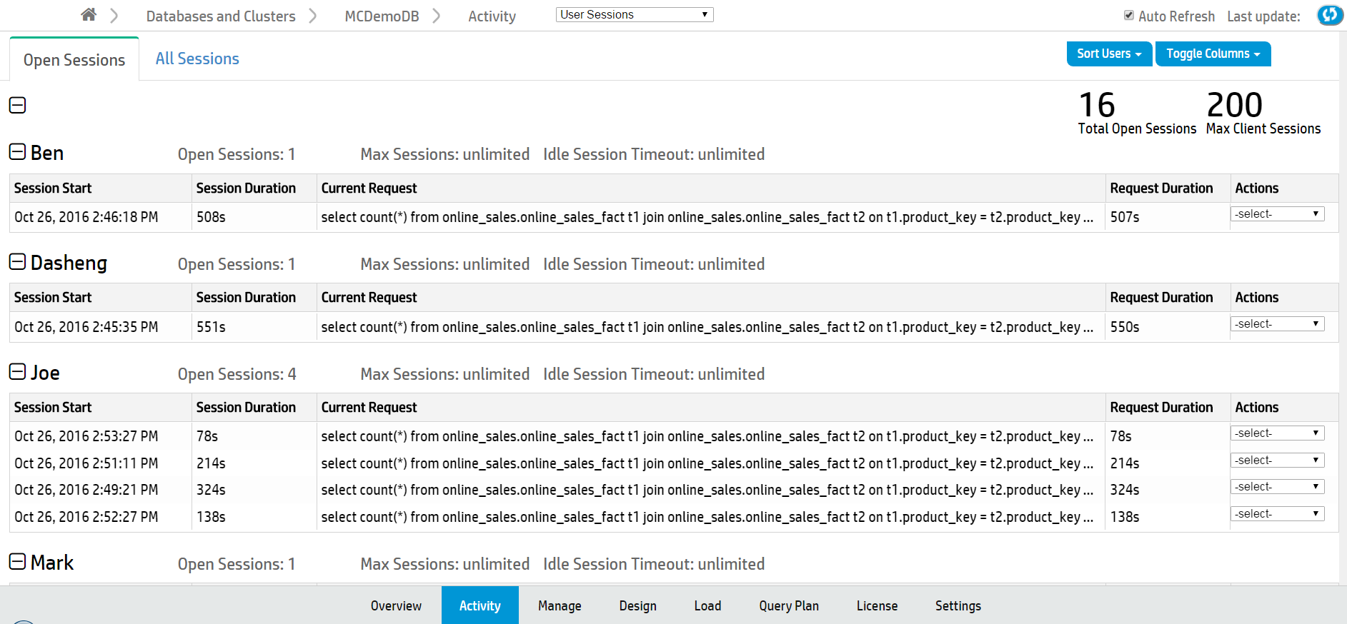
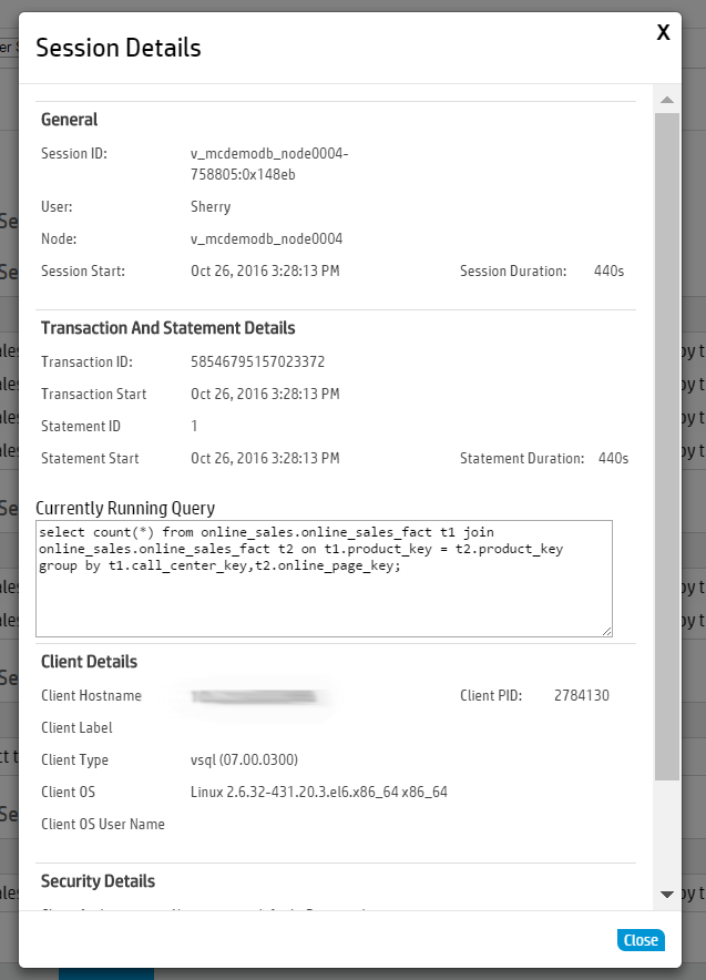
Click any row to open a Session Details dialog that shows more extensive information about that session.
To configure the Open Sessions page display:
-
Use the Sort Users button at the top right of the page to sort by user name or number of open sessions.
-
Use the Toggle Columns button at the top right of the page to select which columns to display. Each table displays session information by column, such as the session start time or the
View all user sessions
The All Sessions tab displays a history of all user sessions in a swim lane chart.
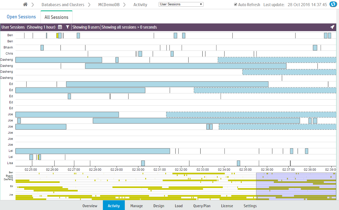
What chart colors mean
Bars outlined with a dotted line are currently running sessions.
Sessions are divided into two colors, yellow and blue.
-
Yellow bars represent user (system) sessions. If you click a yellow bar, MC opens a Detail page that shows all queries that ran or are still running within that session.
-
Blue bars represent user requests (transactions within the session). If you click a blue bar in the graph, MC opens a Detail page that includes information for that query request only.
When you hover your mouse over a transaction bar, a dialog box provides summary information about that request, such as which user ran the query, how long the transaction took to complete, or whether the transaction is still running.
Filter chart results
Extremely busy systems will show a lot of activity on the interface, perhaps more than you can interpret at a glance. You can filter chart results in several ways:
-
Zoom. The context chart at the bottom of the page highlights in blue which section of the All Sessions chart you are viewing. Click and drag the blue box left or right to view earlier or later user sessions. Click and drag the edges of the blue box to zoom in or out.
-
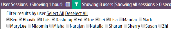
Select fewer users. Click the filter icon ( ) at the top of the page. A menu of a menu of all available users appears below. Deselect users to exclude from the chart.
-
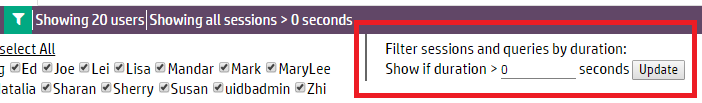
Change the session duration (how long a session took to run). Click the Filter icon () at the top of the page. The Filter sessions and queries by duration field appears below. Enter the minimum session length (in seconds) to display on the chart and click Update.
-
Specify a time frame. Click the Calendar icon ( ) at the top of the page to display the From and To fields. Using the fields, select the time frame to display in the chart and click Update.
4 - Monitoring system memory usage with MC
The Memory Usage chart shows how system memory is used on individual nodes over time.
The Memory Usage chart shows how system memory is used on individual nodes over time. Information the chart displays is stored based on Data collector retention policies, which a superuser can configure. See Configuring data retention policies.
The first time you access the Memory Usage chart, MC displays the first node in the cluster. MC remembers the node you last viewed and displays that node when you access the Activity page again. To choose a different node, select one from the Nodes drop-down list at the bottom of the chart. The chart automatically refreshes every five minutes unless you disable the Auto Refresh option.
Tip
On busy systems, the Node list might cover part of the graph you want to see. You can move the list out of the way by dragging it to another area on the page.
Types of system memory
The Memory Usage chart displays a stacking area for the following memory types:
-
swap
-
free
-
fcache (file cache)
-
buffer
-
other (memory in use by all other processes running on the system besides the main Vertica process, such as the MC process or agents)
-
Vertica
-
rcache (Vertica ROS cache)
-
catalog
When you hover over a data point, a dialog box displays percentage of memory used during that time period for the selected node.
5 - Monitoring system bottlenecks with MC
The System Bottlenecks chart helps you quickly locate performance bottlenecks on a particular node.
The System Bottlenecks chart helps you quickly locate performance bottlenecks on a particular node. The first time you access the Activity page, MC displays the first node in the cluster. To choose a different node, select one from the Nodes drop-down list at the bottom of the chart.
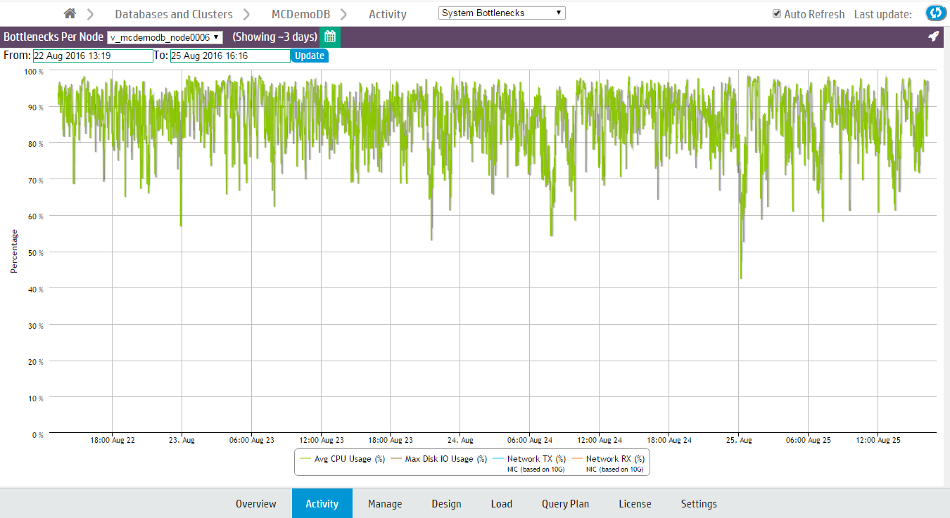
The System Bottlenecks chart reports what MC identifies as the most problematic resource during a given time interval. You can use this chart as a starting point for investigation.
How MC gathers system bottleneck data
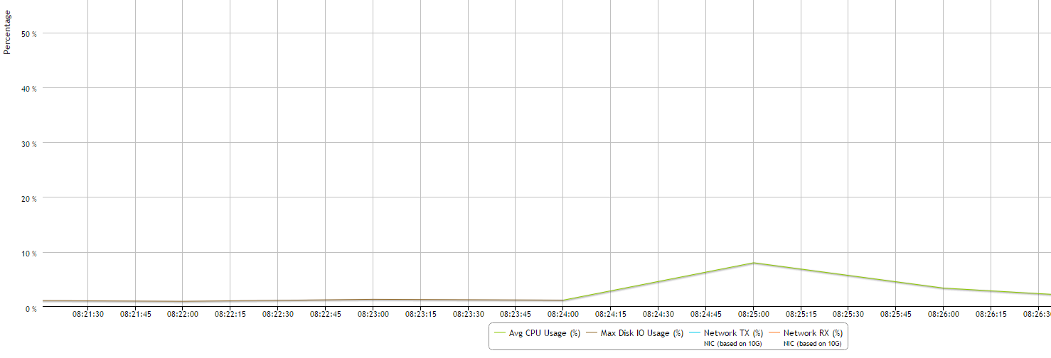
Every 15 minutes, MC takes the maximum percent values from various system resources and plots a single line with a data point for the component that used the highest resources at that point in time. When a different component uses the highest resources, MC displays a new data point and changes the line color to make the change in resources obvious. Very busy databases can cause frequent changes in the top resources consumed, so you might notice heavy chart activity.
In the following example, at 08:24 the maximum resources used changed from Disk I/O to CPU. The System Bottlenecks charts denotes this with a change in line color from brown to green.
The components MC reports on
MC reports maximum percent values for the following system components:
-
Average percent CPU usage
-
Average percent memory usage
-
Maximum percent disk I/O usage
-
Percent data sent over the network (TX)
-
Percent data received over the network (RX)
How MC handles conflicts in resources
If MC encounters two metrics with the same maximum percent value, it displays one at random. If two metrics are very close in value, MC displays the higher of the two.
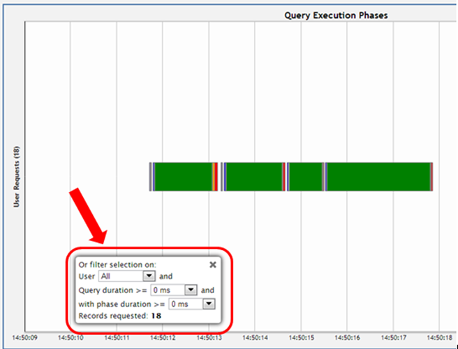
6 - Monitoring user query phases with MC
The User Query Phases chart provides information about the query execution phases that a query goes through before completion.
The User Query Phases chart provides information about the query execution phases that a query goes through before completion. Viewing this chart helps you identify at a glance queries possibly delayed because of resource contention.
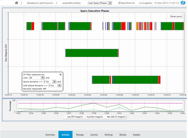
Each bar, bound by a gray box, represents an individual query. Within a query, a different color represents each query phase. The chart does not show phases for queries with durations of less than 4 seconds. Blank spaces within a query represent waiting times, as in the image below.
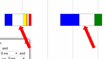
Hover over a phase in the query for information on the phase type and duration.
The chart shows queries run over the last 15 minutes. The chart automatically refreshes every five minutes, unless you clear the Auto Refresh option in the toolbar.
Filtering chart results
You can filter what the chart displays by selecting options for the user running the query, minimum query duration, and minimum phase duration.
Viewing more detail
To zoom in for detail, click-drag the mouse around a section of the chart. Click Reset Zoom, located at the top right corner of the chart, to restore the chart to its original view.
For more detail, click a query bar. The Detail page opens to provide information about the queries in tabular format, including the query type, session ID, node name, query type, date, time, the actual query that ran, and an option to run Explain Plan or profile the query. Click a table column header to sort the queries by that category.
To export the contents of the table to a file, click Export, located at the upper right of the page.
To return to the main Queries page, click Activity in the navigation bar.
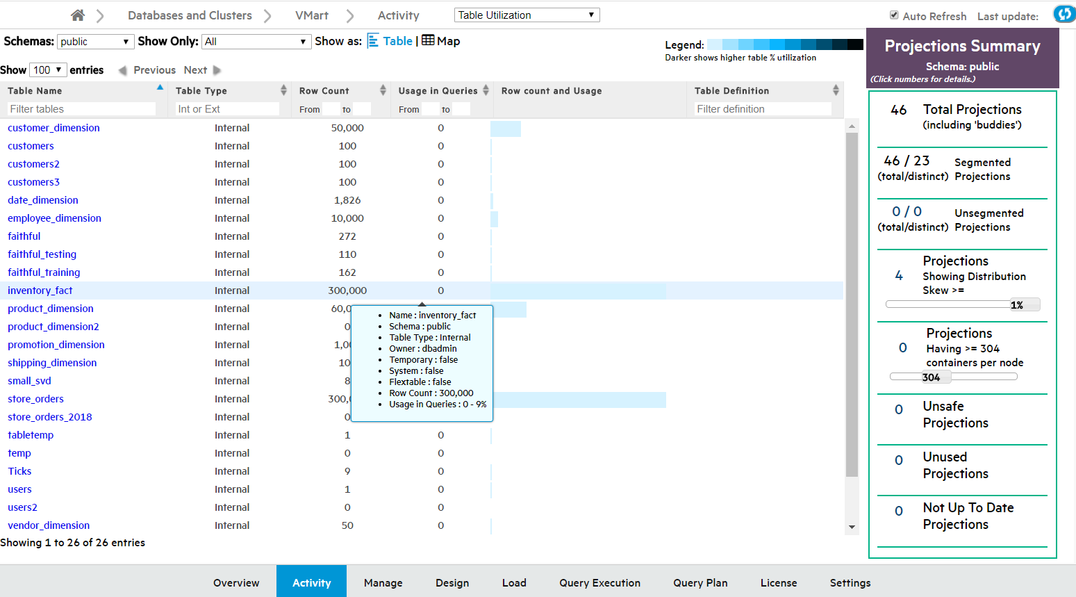
7 - Monitoring table utilization and projections with MC
The Table Utilization activity page helps you monitor tables and projections in your database by schema.
The Table Utilization activity page helps you monitor tables and projections in your database by schema.
Use the Table Utilization charts for a listing of all the tables in a schema, which you can filter and sort; or view them by size and usage in a treemap visualization. These charts allow you to identify outliers among your tables, such as those that are large or overused.
The Projections Summary, located on the right side of the page, provides an overview of the projections in the schema. You can use this summary to help identify if projections are evenly distributed across nodes.
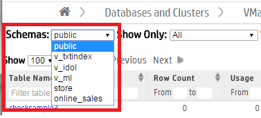
Visualize tables
MC shows you the public schema by default. To specify which schema to view, choose one from the Schemas menu at the top of the activity page. The summary of tables and projections in that schema appear on the page.
MC visualizes your available tables by schema in a table chart or as a treemap chart. From the Show As menu, choose Table for a tabular chart or Map for a treemap chart. By default, MC displays the Table chart.

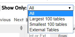
Depending on the number of tables in the schema, the chart may be crowded. To narrow it down, use the Show Only filter at the top of the page to display only the largest 100 tables, smallest 100 tables, or external tables.
View the table chart
The Table chart is a tabular view of the schema's table data. Use the tabular view to filter or sort on any columns, and view the explicit values for row counts and utilization.
The columns display each table's:
-
Table Name. Click this name to see the Table Details page.
-
Table Type: Internal, Working with external data or HCatalog. (Details such as row count and usage are not available for external and HCatalog types.)
-
Row Count.
-
Usage in Queries, by percentage of time the table is queried.
-
Row count and Usage, visualized as a bar. The length of the bar indicates row count; a darker color indicates higher usage.
-
Table Definition. The COPY statement table definition, only applicable to external tables.
Hover over any row in the chart to view the table's properties (shown for inventory_fact in the screen capture below). Click the table name to view its more in-depth Table Details page.
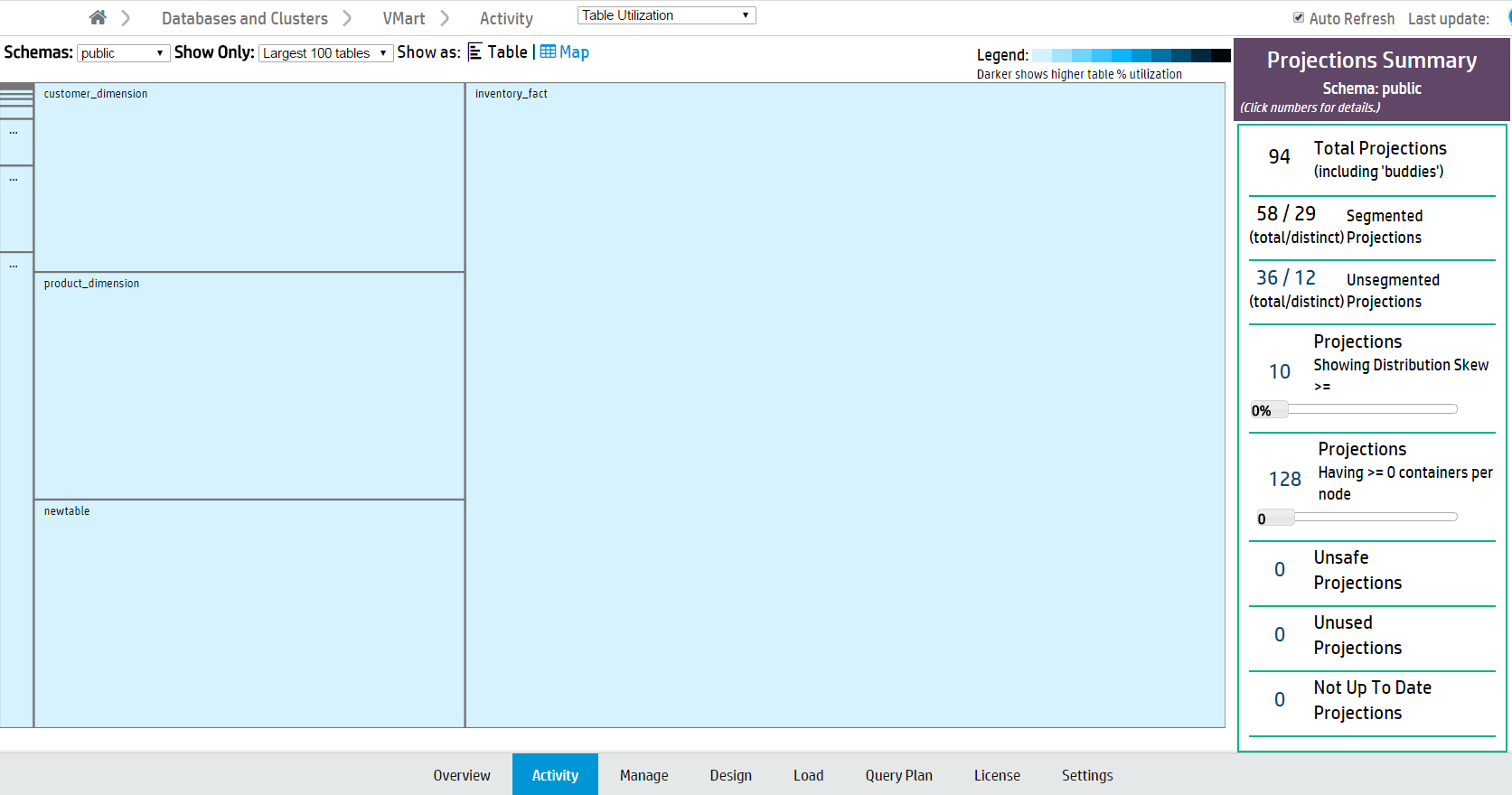
View the treemap chart
In the Treemap visualization, tables are represented by boxes, nested by size and colored by usage. Darker colors indicate higher table usage.
Hover over a table to view more details, or click to view its Table Details page.
View table details
The Table Details page displays a detailed overview of internal Vertica tables. (This is not available for external and HCatalog tables.) Click a table name on the Table Utilization Activity page to open its Table Details page in a new window.
You can view the following details:
-
Table Properties. Table properties (such as row count and owner).
-
Projections. The properties of the table's columns and projections.
-
Storage by Node. The table's storage utilization per node, in MB.
-
# Deleted Rows by Node. Vertica allocates physical storage to deleted rows until they are purged by the Tuple Mover.
-
# Delete Vectors by Node. Vertica creates small containers called delete vectors when DELETE or UPDATE statements run on a table. A large number of delete vectors can adversely impact performance. (See Deletion marker mergeout.)
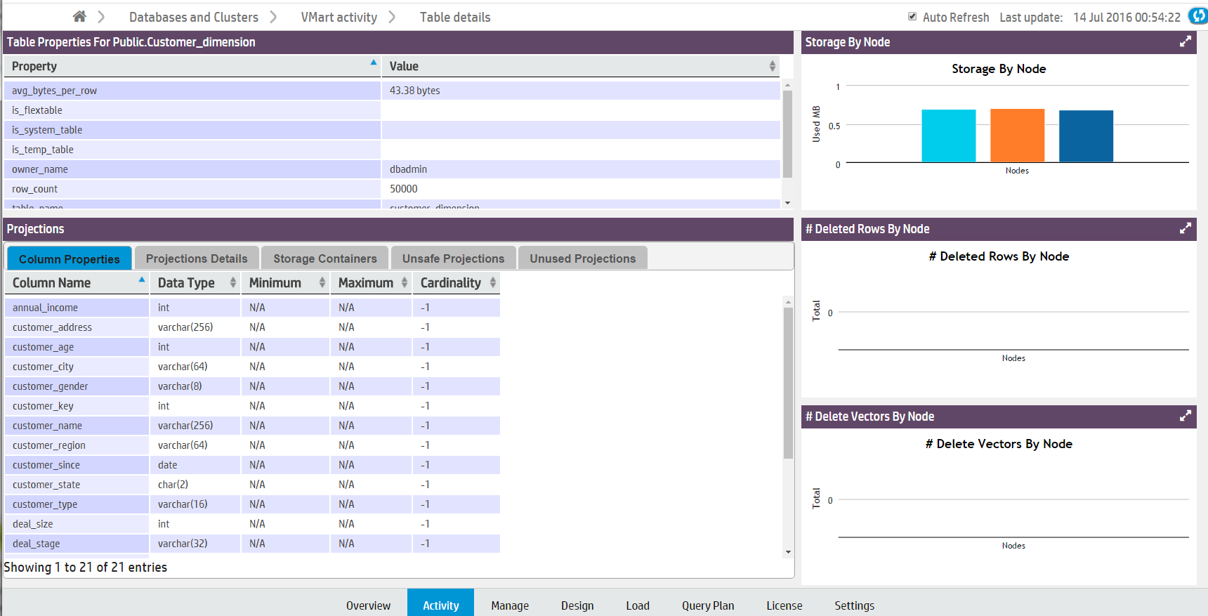
Note
Note: If you have deleted table rows recently, Management Console may not display the most recent row count. MC updates the row count when mergeout occurs. See
Mergeout.
Projections summary
The Projections Summary is located in a side bar on the right side of the Table Utilization page. It displays the following statistics of all projections in a schema:
-
Total projections.
-
Segmented projections, the number of projections segmented across multiple nodes.
-
Unsegmented projections, the number of projections that are not segmented across multiple nodes.
-
Projections Showing Distribution Skew, the number of projections unevenly distributed across nodes. Tables with fewer than 1000 rows are not counted. Move the slider to configure filter by distribution skew percentage.
-
Projections Having >= Containers Per Node. Move the slider to specify the minimum number of containers.
-
Unsafe Projections, the number of projections with a K-safety less than the database's K-safety.
-
Unused Projections.
-
Not Up to Date Projections.
Click a projections number to view a list of the specified projections and their properties. For more about projections, see Projections.
See also
8 - Monitoring running queries with MC
The Query Monitoring activity page displays the status of recent and currently running queries, and resource information by user and node.
The Query Monitoring activity page displays the status of recent and currently running queries, and resource information by user and node. For Eon Mode databases, you can also display the status of queries by subcluster. From this page, you can profile a query or cancel a running query.
Use this page to check the status of your queries, and to quickly cancel running or queued queries to free up system resources. This page can help you identify where resources are being used, and which queries, users, nodes, or subclusters are using the most resources.
The Query Monitoring page includes four tables, displayed as tabs:
-
Running queries
-
Queued queries
-
Completed queries
-
Failed queries
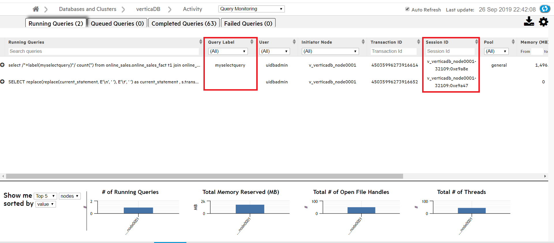
From the Actions column you can:
-
Cancel. Cancel a running or queued query.
-
Close session. Close a session for a running or queued query.
-
Explain. Open the Query Plan page for any query.
-
Profile. Profile any query on the Query Plan page.
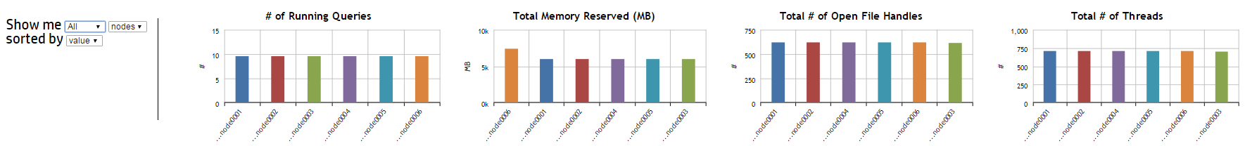
The four bar charts at the bottom of the page display aggregate query usage by node or user. Hover over a bar with your cursor to see its value. When sorted by value, the left-most bar in each chart represents the node or user with the highest value.
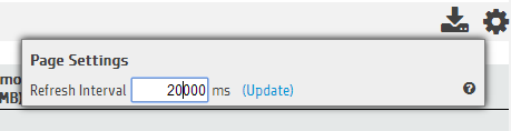
The Query Monitoring page refreshes every 20 seconds by default. To change the refresh interval, click the Page Settings button in the upper-right corner of the page. A dialog appears. Type the new refresh interval, in milliseconds, in the text box.
Sorting or searching queries by session ID or client label
The Query Monitoring Activity > Running Queries page includes columns that display the Session ID and Client Label for each query. You can sort the queries by Session ID or Client Label, or use the search field below either column to search for queries with a specific Session ID or Client Label.
Filtering chart results
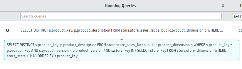
Use the search field below each column title to narrow down your chart results. (For example, if you enter the text SELECT product_description in the Search Queries field and select a specific node in the Initiator Node column, the chart returns only queries which both contain that text and were initiated on the node you specified.)
Click a column title to sort the order of the queries by that category.
There may be a large number of results for Completed and Failed Queries. Use the Customize section at the top of these two tabs to further filter your chart results. For either tab, you can select a custom date and time range for your results.
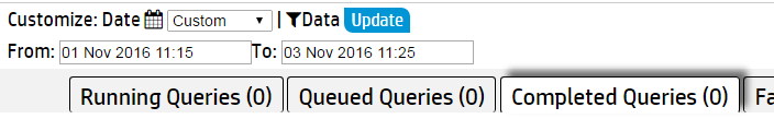
In the Completed Queries tab, click Data to enter additional query information to filter based on any of the following fields:
-
User
-
Request
-
Request Duration
-
Node
-
Request label
Viewing more details
Click a query to view the entire query.
In the Failed Queries chart, click the plus (+) icon next to a failed query to see the failure details for each node involved in the query's execution.
To export the data in one of the Query Monitoring tables, click the table's tab, then click the Export ( ) button in the upper-right corner of the page. The browser downloads the data for that chart in a .dat file. The data exported includes columns that may not be visible in the MC, including the minimum and maximum values for Memory, Thread Count, and Open File Handles.
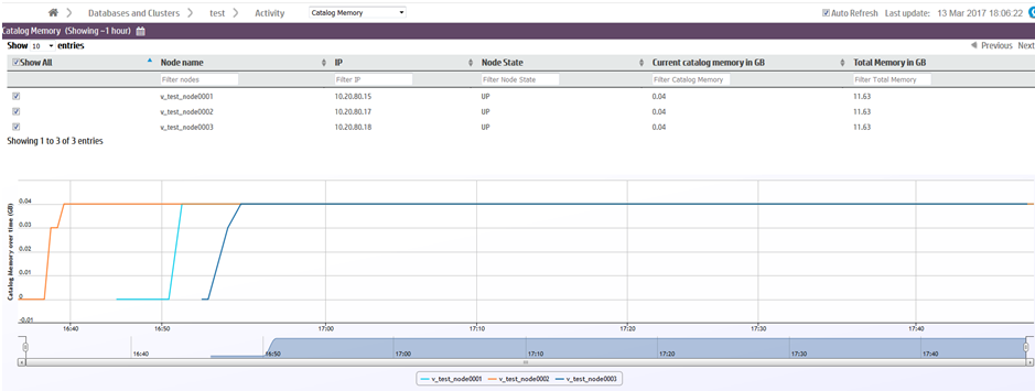
9 - Monitoring catalog memory with MC
The Catalog Memory activity page displays the catalog memory for each node.
The Catalog Memory activity page displays the catalog memory for each node. Use this page to check for sudden changes in catalog memory, or discrepancies in memory distribution across your nodes.
The Catalog Memory page displays:
-
A node details table. The table lists the details of each node in the database, including their current catalog memory and total memory usage.
-
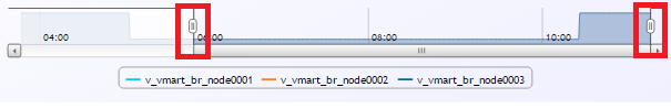
A catalog memory chart. A line graph visualization of each node's catalog memory usage over time. Each line represents a node. The color legend at the bottom of the chart indicates the color of each node's line.
In the image below, catalog memory begins at 0GB for all three nodes. Over the next twenty minutes, catalog memory increases to 0.04GB in the second node (orange), then the first node (cyan), and finally in the third node (dark blue). Starting at 16:55, note that the three overlapping node lines appear as one line when all three nodes have the same catalog memory.
Filtering chart results
If you have many nodes in your database, you may want to display only certain nodes in the catalog memory chart. You can remove nodes from the chart in two ways:
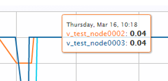
Viewing more details
Hover over any line in the chart to view the time, node name, and catalog size.
At the bottom of the chart is a summary bar that shows a quick overview of the catalog memory over time. Move the sliders on either side of the chart to zoom in on a specific time frame in the chart. When zoomed in, you can use the scrollbar to move forward or backward in time.